Ben Judah: How is this chart hiding Brexit...
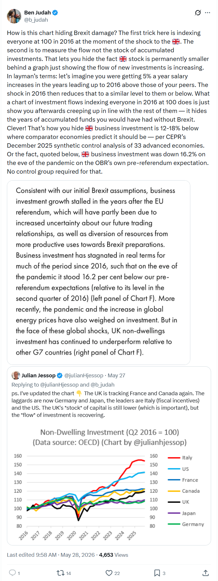
How is this chart hiding Brexit damage? The first trick here is indexing everyone at 100 in 2016 at the moment of the shock to the 🇬🇧. The second is to measure the flow not the stock of accumulated investments. That lets you hide the fact 🇬🇧 stock is permanently smaller behind a graph just showing the flow of new investments is increasing. In layman’s terms: let’s imagine you were getting 5% a year salary increases in the years leading up to 2016 above those of your peers. The shock in 2016 then reduces that to a similar level to them or below. What a chart of investment flows indexing everyone in 2016 at 100 does is just show you afterwards creeping up in line with the rest of them — it hides the years of accumulated funds you would have had without Brexit. Clever! That’s how you hide 🇬🇧 business investment is 12-18% below where comparator economies predict it should be — per CEPR’s December 2025 synthetic control analysis of 33 advanced economies. Or the fact, quoted below, 🇬🇧 business investment was down 16.2% on the eve of the pandemic on the OBR’s own pre-referendum expectation. No control group required for that.
https://x.com/b_judah/status/2059892125051846907?s=20